Align-center ● Case study
🧱 1. Context of the Case
Centered alignment is commonly used for headings, minimalist interfaces, landing pages, or emotionally charged content (e.g., quotes, slogans). However, some designers argue that this type of alignment can hinder readability, especially for longer paragraphs. Their arguments focus on difficulties in scanning text, the absence of a clear left-aligned visual anchor, and inconsistent line structure.

❓2. Problem / Opportunity
The core question explored here is: Does centered alignment genuinely reduce readability and fluency in digital design, or can it be used effectively in certain contexts?
🗂️ 3. Research Plan (Planning)
To assess the impact of centered alignment on readability, we analyzed a real interface found on Dribbble. The selected page contains various textual elements — headings, paragraphs, buttons — all center-aligned.
🎯 4. Study Phase
4.1 Design – Kevin
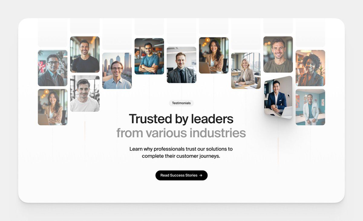
To explore how centered alignment affects the user experience, we analyzed a design found on Dribbble. This layout features a “Testimonials” section, a common component on modern websites, where most text elements are center-aligned.
4.1.1 Data Collection
– Dribbble design by Kevin
4.1.2 Data Summary
The selected section includes three main center-aligned elements:
– An introductory title
– A testimonial or quote
– A call-to-action (CTA) button
This kind of layout is often used in modern design for its clean and balanced appearance. We analyzed how this alignment affects readability, visual hierarchy, and the overall user experience in this particular use case.
4.1.3 Pain points
4.1.3.1 Irregular Shape
Unlike left alignment, which creates a clean vertical edge, center alignment produces a visually unstable block of text. The result resembles an “inverted triangle” or floating shape, which is harder to visually scan — especially when line lengths vary significantly. This negatively impacts readability, particularly with longer paragraphs.
4.1.3.2 Inconsistent Line Start
With centered alignment, the eye never lands at the same point from one line to the next. This forces the reader to constantly adjust in order to locate the start of each line, which slows down reading and increases cognitive effort, particularly on screens.
4.1.3 Strengths
4.1.3.1 Symmetry
Center alignment can create a natural sense of symmetry, which reinforces visual harmony — especially in isolated sections like testimonials. It draws the user’s attention toward the center, emphasizing the main message.
4.1.3.2 Visual Balance
In some contexts — such as layouts with little content or minimalist pages — center alignment can provide a pleasing balance. It works well in vertical compositions, where each element (heading, paragraph, button) is stacked and aligned along a central axis.
4.1.3.3 Quotation Style
Centering often works well for quotes and testimonials. It gives them a more solemn, “featured” appearance, visually separating them from surrounding content. This style supports emotional or symbolic messaging, which aligns well with the purpose of a testimonial section.
📘 5. Insights & Takeaways (Conclusion)
Rather than adopting or rejecting center alignment by default, it’s important to evaluate its real impact on the user experience — always in context. Layout or typographic decisions should never be based on habit or trend alone. A solid understanding of the underlying mechanics is what enables designers to craft interfaces that are both elegant and effective.