Le forem ● Case study
🧱 1. Case Context
Le Forem is the public employment and training service of Wallonia. Its website is a major entry point for citizens seeking jobs, training, or support services. This case study focuses on the experience of end users — primarily citizens undergoing professional transitions — as they navigate the site. The context involves independent usage, sometimes in situations of urgency or vulnerability, with very diverse user profiles in terms of digital literacy. This analysis takes into account the institutional objectives of Le Forem (accessibility, clarity of offerings, user support) while highlighting any potential frictions users may encounter in their online journeys.

❓2. Problem / Opportunity
During my initial interactions with the Le Forem website, I encountered difficulties understanding its structure, available features, and the actual usefulness of certain sections. The navigation felt complex and unintuitive, making access to essential services (such as training searches or appointment scheduling) challenging for unfamiliar users. This experience led me to question the clarity of information, user guidance, and the site’s ability to meet citizens’ needs effectively. This observation opened up an opportunity for UX analysis aimed at identifying points of confusion and suggesting improvements focused on user expectations and real-world user journeys.
🗂️ 3. Research Plan (Planning)
For this study, I chose to focus my analysis on a representative sample of key pages on the Le Forem website: the homepage, the user profile page (personal space), the contact page, the search feature, and the news section. These pages were selected because they include both essential entry points and frequent interactions, representing typical citizen user journeys. The goal is to observe how users orient themselves, access information, interact with content, and understand the usefulness of the online service through these interfaces.
🎯 4. Study Phase
4.1 Homepage
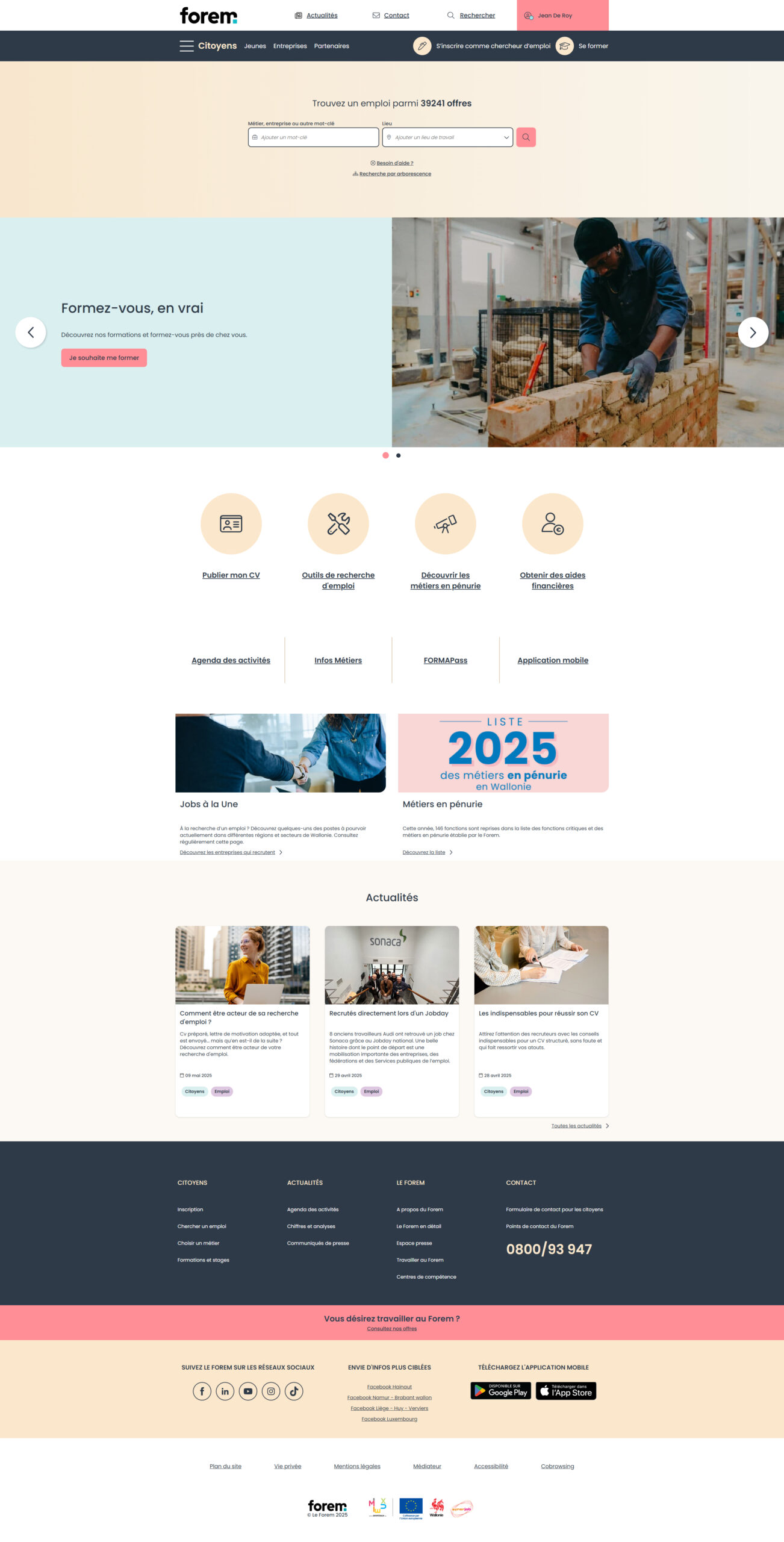
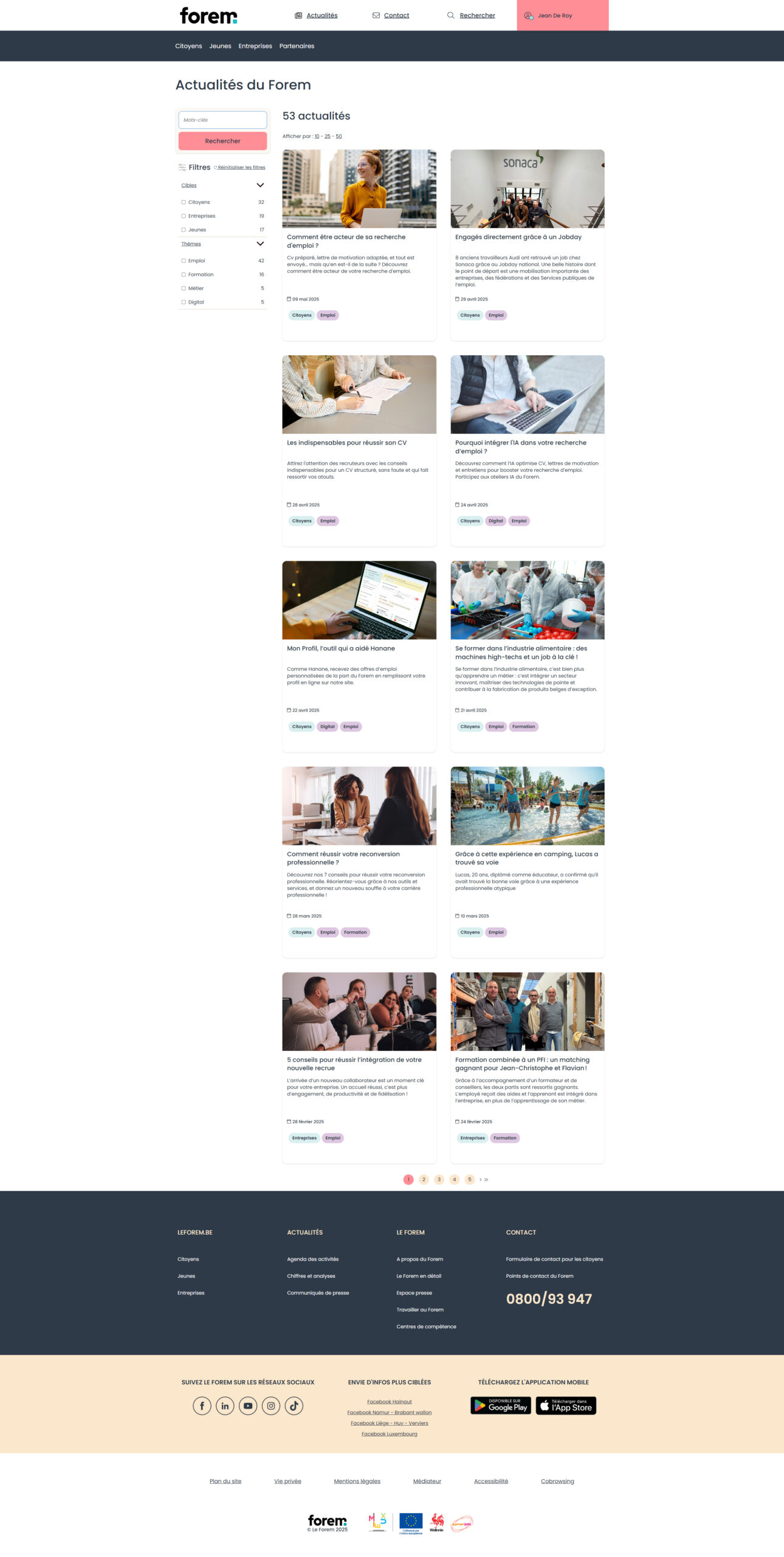
The homepage is the first point of contact between Le Forem’s website and its users. It plays a key role in orientation, understanding the service offering, and providing quick access to common tasks. This unit of analysis aims to assess the homepage’s ability to meet citizen expectations: clarity of messaging, readability of proposed actions, information hierarchy, and relevance of direct links. The goal is to determine whether the page facilitates entry into the site — or, on the contrary, creates confusion from the outset.
4.1.1 Data Collection
– Homepage of the Le Forem website
4.1.2 Data Summary
The homepage opens with a job search module, composed of two input fields: one for typing a keyword (job title, skill, etc.), and another for specifying a location. This search bar occupies a prominent position at the top of the page.
Just below, an automatically rotating slider cycles through two promotional visuals, each accompanied by two call-to-action (CTA) buttons. These slides promote Forem services or programs, but are not directly linked to the main user journeys.
Next comes a section with four “cards” linking to specific tools, followed by another block with four links to practical resources focused more on guidance and information.
Further down, there are two additional cards highlighting recent content, followed by an entire section dedicated to news, with three cards showing recent articles.
4.1.3 Pain Points
4.1.3.1 Unclear Primary Functionality
The homepage does not clearly highlight the site’s core purpose. Users may find it difficult to understand what they are supposed to do first, which negatively affects navigation efficiency.
4.1.3.2 Dual Navigation Menus
The presence of two stacked navigation bars causes confusion. The lack of hierarchy between the two levels affects readability and makes it harder for users to grasp the site’s structure right from the start.
4.1.3.3 Duplicate News Sections
The homepage includes two separate news sections, without any clear distinction or editorial logic. This fragments the content, scatters the user’s attention, and contributes to information overload.
4.1.3.4 Ineffective Slider
The carousel at the top of the page doesn’t provide priority information and seems more decorative than informative. It takes up significant space without delivering clear value to the user.
4.1.3.5 Missing the 5 W’s
Users don’t immediately get answers to the fundamental questions: Who is this site for? What services are offered? How can they be used? In what context? For what purpose? The lack of clear orientation prevents users from quickly understanding the site’s role and the services available.
4.2 Profile Page
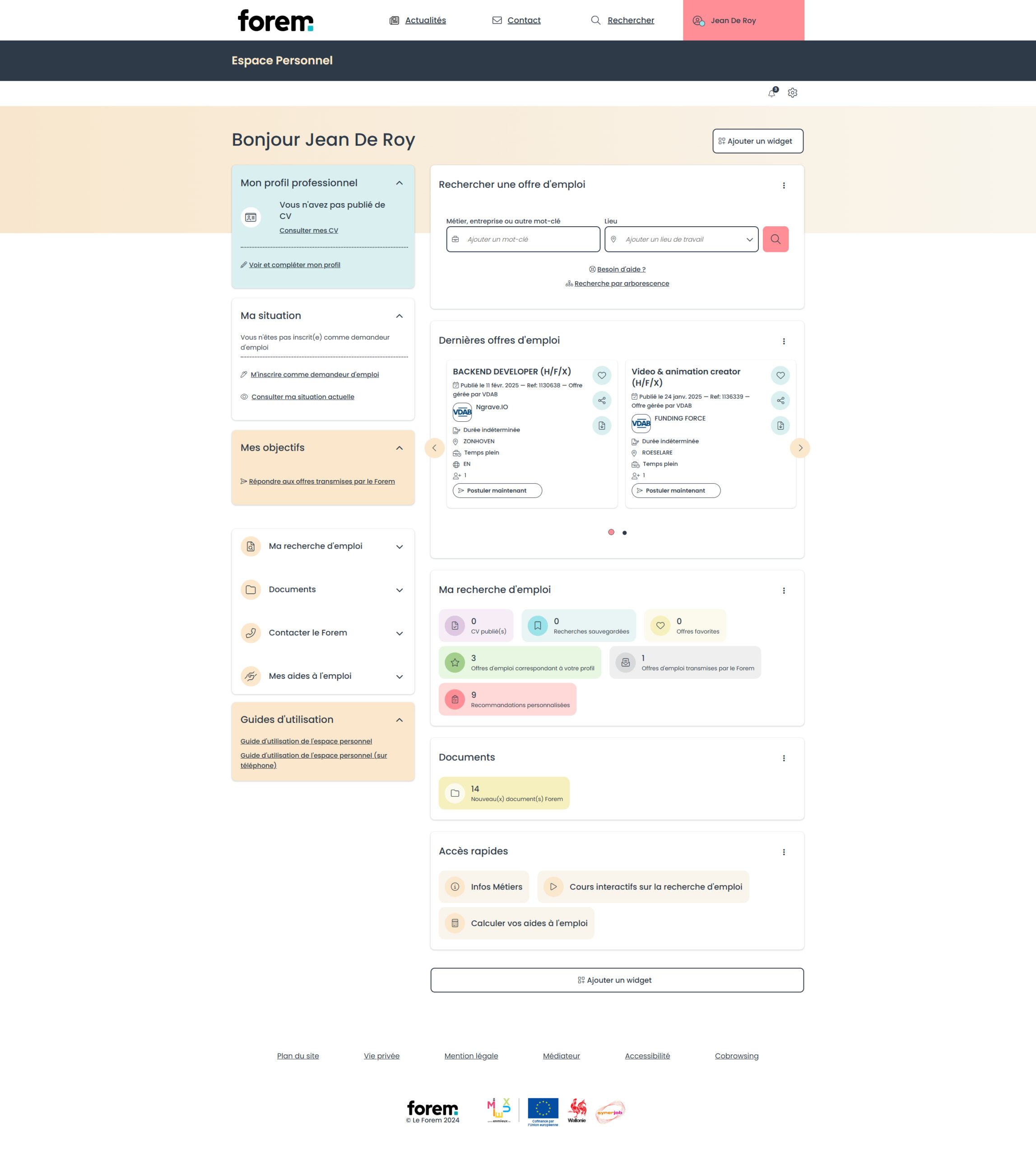
The personal space is a strategic area for users who are registered, serving as a hub for managing applications, file tracking, training registrations, and more. This unit of analysis examines the clarity of navigation, the readability of the information displayed, and the overall usability of the interface. It also considers the user’s sense of control—or lack thereof—in a potentially sensitive and high-stakes environment.
4.2.1 Data Collection
– Personal account area on the Le Forem website
4.2.2 Data Summary
4.2.2.1 Left Column (Informational and Functional Area)
This column groups several key sections related to the user’s personal situation, including:
• A section dedicated to the résumé
• A box titled « My Situation », summarizing administrative or professional information known by Le Forem
• A block labeled « My Goals », supposedly reflecting the user’s ambitions or plans
• A « Quick Access » module linking to certain key actions or spaces
• A link to a user guide designed to help users understand the interface
4.2.2.2 Right Column (Dynamic and Modular Area)
This column offers a series of informational or interactive widgets, often presented as tiles, such as:
• An internal search bar
• A box with suggested job offers
• A « My Documents » section
• Redundant quick access blocks (duplicating those on the left)
• Other contextual modules that vary depending on the user’s situation
4.2.3 Pain Points
4.2.3.1 Page Architecture
The overall structure of the personal space lacks clarity. Sections are not clearly defined, making internal navigation difficult. Users struggle to understand how the page is organized and where to find essential tools for tracking or taking action.
4.2.3.2 Too Much Information
From the moment users land on the page, they are confronted with a flood of information. This density leads to cognitive overload, making it hard to focus and identify what is most important.
4.2.3.3 Usefulness of Widgets
Several blocks or “widgets” are present in the personal area, but their usefulness is not always clear, and some are duplicated. Certain widgets seem decorative or redundant, which impacts readability and diverts attention from features that truly matter.
4.2.3.4 Not a Real “Profile” Tab
The label « personal space » or « profile » does not align with what users typically expect from such a section. There are very few personalized elements or settings tied to the user’s identity or preferences. This naming inconsistency may lead to frustration or confusion.
4.3 Search Page
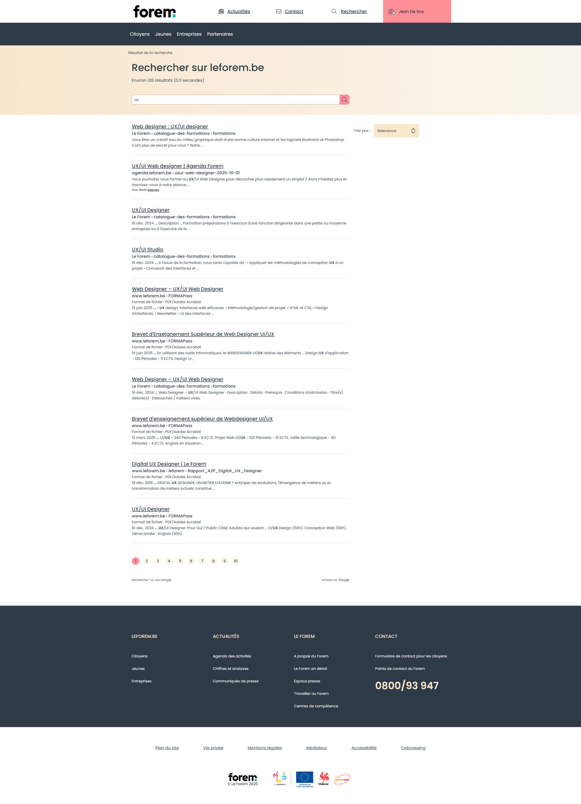
The search engine is a common entry point for users looking for training opportunities, job offers, or specific services. This section aims to evaluate the effectiveness of the search tool: result relevance, available filters, keyword comprehension, and overall user experience (speed, intuitiveness, result clarity). It helps determine whether the tool facilitates access to information or acts as a barrier.
4.3.1 Data Collection
– Search page on the Le Forem website
4.3.2 Data Summary
Search bar at the top of the page
Users can enter a keyword and/or location to refine their search. No advanced filters are displayed by default, which limits sorting options at this stage.
Results list
Results are shown as a vertical list. Each item includes:
• A clickable title that links to the resource (job offer, training, informational page, etc.)
• A contextual label indicating the type of content (category, service, etc.)
• A brief description, often lacking detail
Sorting menu
A sorting button allows users to change the order of the results based on criteria such as relevance, date, or other options. However, this menu is discreet and could easily be overlooked.
4.3.3 Pain Points
4.3.3.1 Everything in one basket
Search results mix various content types (job offers, training sessions, info pages, articles, etc.) without any visual distinction or explicit filtering options. This lack of categorization makes it hard to scan the list, forcing users to mentally sort the results, which undermines usability and efficiency.
4.3.3.2 No affordance
Interactive elements are not always clearly identifiable. Some buttons, links, or filter fields lack visual cues (shapes, colors, icons) that would indicate their function. This lack of affordance slows down exploration and prevents users from interacting with the interface smoothly and intuitively.
4.4 Contact Page
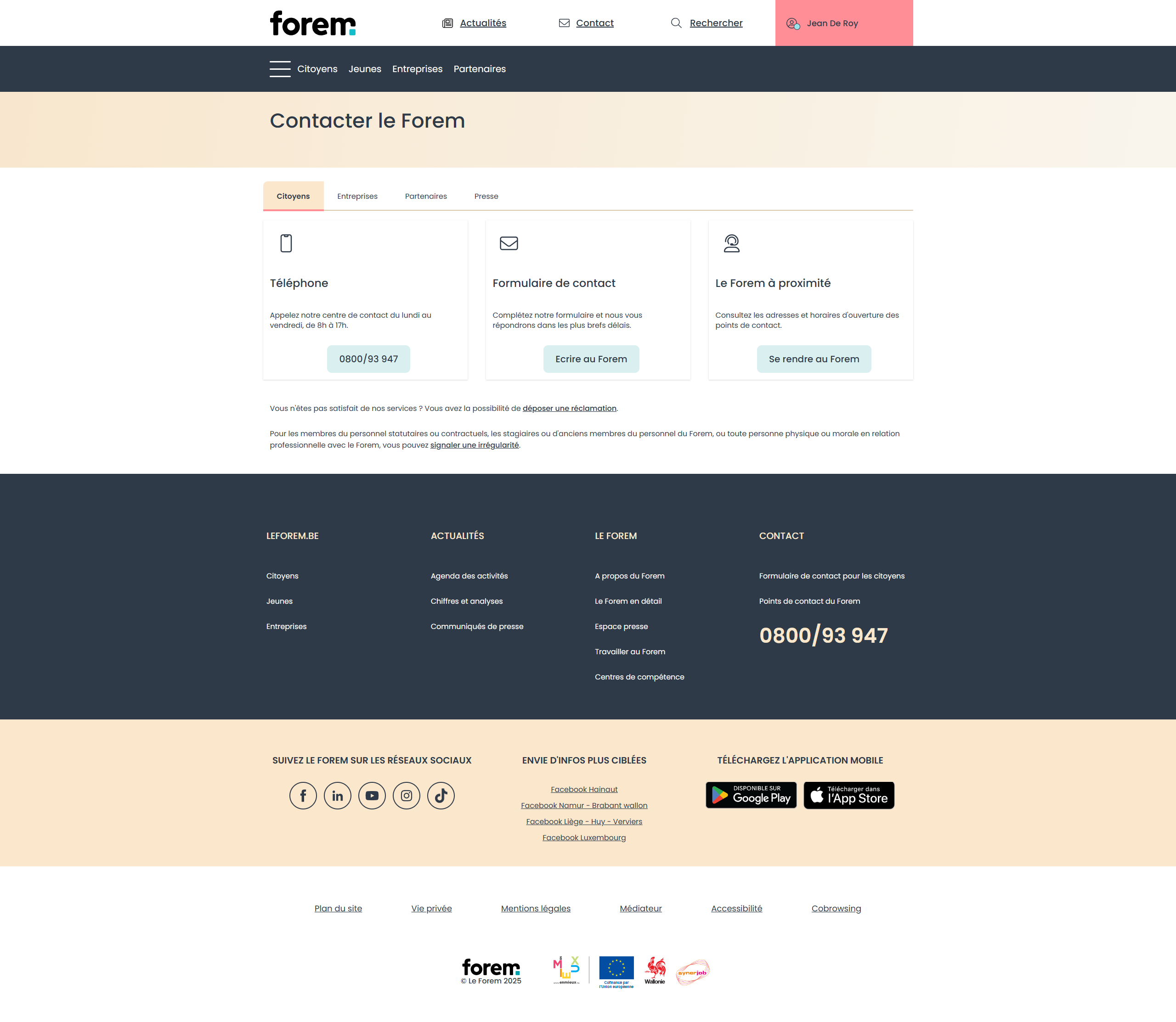
The contact page is essential for allowing users to ask questions, request help, or access human support. This analysis focuses on the clarity of the available contact channels (phone, email, form, chat, etc.), their accessibility, and how different user profiles (job seekers, companies, students, etc.) are directed to the appropriate contact point.
4.4.1 Data Collection
– Contact page on the Le Forem website
4.4.2 Data Summary
The contact page is structured around four main tabs, each corresponding to a specific target audience: Citizens, Businesses, Partners, and Press. The user must choose the relevant tab to access the appropriate information. This step is not always intuitive and can be a barrier if the user is unsure of which category they fall into.
Within the “Citizens” tab, the content is organized into three informational boxes: Phone, Contact Form, and Visit in Person. Each box follows the same visual format: icon + title + description + CTA (Call-to-Action).
4.4.3 Pain Points
4.4.3.1 The 5 W’s
The page does not clearly answer the user’s fundamental questions: Who should I contact? Why? When are they available? How does the contact process work? Where can I reach them (online or in person)? This lack of clarity complicates decision-making and adds unnecessary cognitive load.
4.4.3.2 Availability of Information
Practical details (phone numbers, hours, preferred channels) are not immediately visible or emphasized. Users must click on tabs or actively search for essential information. This dispersion slows down access to help and may cause frustration—especially in urgent situations.
4.5 News Page
The news page is intended to keep users informed about updates, events, services, or support related to employment and training. This section analyzes how the information is structured, its readability, its relevance to citizens, and whether the page encourages interest or regular visits. It also questions the actual role of this page in the user journey.
4.5.1 Data Collection
– News page on the Le Forem website
4.5.2 Data Summary
The news page is composed of a set of cards arranged in a grid or vertical list. Each card includes:
• A top image,
• A clickable headline linking to the full article,
• A short description providing a preview of the content,
• A clearly visible publication date,
• Tags indicating the topic or intended audience.
The layout is visually consistent, but lacks a clear hierarchy between articles.
A sidebar contains a search bar allowing users to look up news items by keyword. While useful, this feature remains quite basic in functionality.
A filtering system complements navigation. It takes the form of checkboxes, allowing users to filter articles by theme, information type, or target audience.
4.5.3 Pain Points
4.5.3.1 Categories
The content is not organized by theme or information type (e.g., events, support schemes, procedural changes). This lack of categorization makes browsing difficult and undermines the relevance of the news section.
4.5.3.2 The 5 W’s
Published articles do not consistently answer the user’s basic questions: Who is this for? What is the purpose? Where and when does it happen? Why is it important? This lack of context weakens message clarity and user engagement.
4.5.3.3 Information Structure
There is little visual hierarchy between the content elements (titles, summaries, visuals), making it hard to scan the page quickly. It is difficult to distinguish between high-priority, recent, or relevant publications, which may discourage users from regularly checking this section.
💡 5. UX Recommendations
5.1 Proposed solutions
5.1.1 Landing page and dashboard
The first improvement would be to clearly separate the landing page from the personal dashboard. Currently, both blend their functions, which creates confusion for users. A public landing page should focus on general information, services, and guidance, while the dashboard, once logged in, should centralize the user’s personalized actions.
5.1.2 Design system
Next, creating a strong and consistent design system would ensure visual and functional uniformity across all pages of the site. This includes clear hierarchy, reusable components, predictable interactions, and better overall readability. This system would also make the site easier to maintain and evolve over time.
5.1.3 Always answer the 5 W’s
A third key point is to systematically include the 5 W’s (Who, What, When, Where, Why) in all content and interfaces. These basic pieces of information help users immediately understand the purpose of a feature or content. Their absence is currently one of the main barriers to comprehension on the site.
5.1.4 Restructuring and enriching content
Finally, it would be necessary to restructure, clarify, and enrich all content—whether job offers, news articles, or practical information. Pages should be better organized, with clear titles, visible metadata, up-to-date information, and logical categorization. This editorial improvement would strengthen both the site’s usefulness and users’ trust in the services offered.
5.2 Deliverables and prototypes
5.2.1 Dashboard
To address the issues identified in the personal space of the Forem website, I designed a dashboard wireframe focused on the user and their real needs. This redesigned version aims to transform the personal space into a true working tool: simple, readable, and actionable.
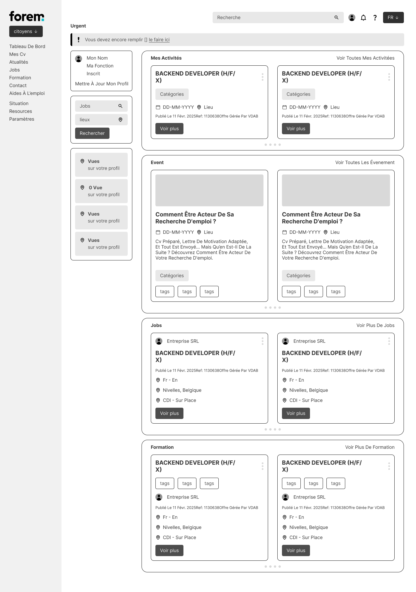
– Wireframe of the dashboard
5.2.1.1 See everything
The new dashboard allows immediate and structured access to all important information. No more scattered or hidden zones: each key element is clearly identified and placed where users expect to find it. The visual hierarchy naturally guides the eye, reducing cognitive load and improving decision-making.
5.2.1.2 Take control
The user regains control of their space. Thanks to simplified navigation, direct access to key functions, and an overview of their progress, the dashboard provides a real sense of mastery. Users know where they stand, what they can do, and how to do it. This clarity boosts autonomy and confidence in the tool.
5.2.1.3 Complete information within reach
Each section of the dashboard provides precise, useful, and contextualized data. There’s no need to dig through the site to understand or retrieve something. Content is grouped logically, well-labeled, and accompanied by visual cues that make it easy to locate. The information is accessible in one click, without detours.
5.2.1.4 A true working tool
This new dashboard is more than just a data display: it actively supports the user in their actions. Designed as a functional workspace, it allows users to track their progress, access documents, manage objectives, and quickly reach helpful services. It’s a tool that enables action, not just a passive interface.
📘 6. Learnings and transferability (conclusion)
This project highlights the importance of clear, structured, and user-oriented information, as well as the central role of design in transforming an institutional website into a real support tool. It also demonstrates how UX can reveal untapped potential and help make public services more accessible, more human, and more effective.