Smart ● Case study
🧱 1. Case Context
Smart is a well-known cooperative that supports self-employed workers in Belgium and several other European countries. It offers administrative, legal, and financial services to help its members focus on their profession while benefiting from a secure framework. The Smart website plays a key role in presenting these services, attracting new members, and informing its wider community.

❓2. Problem / Opportunity
Despite the richness of its services and content, the current homepage suffers from several weaknesses: confusing navigation, unclear information hierarchy, text overload, and a lack of concrete information. These issues hinder the user experience and make it difficult to understand the services, especially for new visitors or audiences unfamiliar with how a cooperative works.
🗂️ 3. Research Plan
For this study, we will focus on the homepage of the website. The objective is to evaluate how effectively it meets user needs upon their first visit.
🎯 4. Study Phase
4.1 Homepage
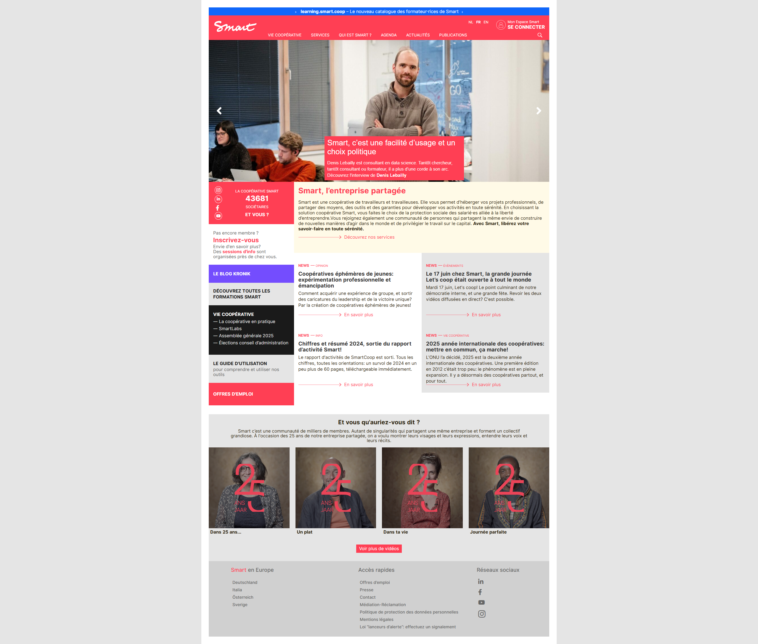
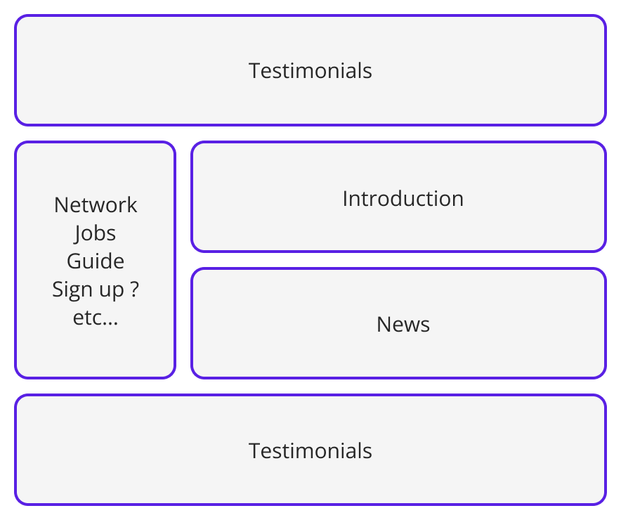
The analysis of Smart’s homepage highlights several friction points that affect the readability, navigation, and accessibility of the interface. These issues impact the clarity of the offer and the efficiency of user journeys.
4.1.1 Data Collection
– Smart website homepage
4.1.2 Data Summary
– Homepage structure of the Smart website
4.1.2.1 Testimonials first?
As soon as users land on the homepage, they are presented with a series of testimonials. While these can help build trust, they do not immediately address the primary needs of new visitors: understanding who Smart is, who the services are for, and what the cooperative actually offers.
4.1.2.2 Only one short introduction paragraph
After the testimonials, there is a short paragraph introducing Smart. This essential content is not very visible and appears buried in the middle of the page. It is neither highlighted nor supported by visuals or calls to action, which limits its impact.
4.1.2.3 Quick access side menu
A vertical menu offers quick access to certain sections. While it could be useful in theory, it adds an extra layer of complexity to an already unintuitive navigation. It’s unclear whether this is a secondary menu.
4.1.2.4 News
Further down, the page displays a selection of news items.
4.1.2.5 More testimonials
Several other testimonials are shown at the bottom of the page. Their repetition gives a feeling of redundancy and adds to the overload. Instead of reinforcing the message, they end up diluting attention and increasing the page’s imbalance.
4.1.3 Pain points
4.1.3.1 Contrast issues
Several areas of the site show insufficient contrast between text and background, particularly in buttons and some information blocks. This lack of legibility impacts accessibility for visually impaired users and may cause visual fatigue for all users. It goes against best practices defined by WCAG standards (level AA or AAA).
4.1.3.2 Disorganized information architecture
The page structure lacks consistency. Content blocks don’t follow a clear logic or user-oriented flow. It’s difficult to know where to focus, and the cooperative’s service offering is not highlighted in a structured way. As a result, visitors struggle to understand what Smart does and what they can do from the homepage.
4.1.3.3 Double navigation
The coexistence of two main navigation bars — one at the top of the page and one within a sub-menu — unnecessarily complicates the interface. This creates cognitive confusion: users don’t know which menu to use or what to expect when they click. A single, clear, and well-structured navigation would be more effective.
4.1.3.4 Weak text hierarchy
The typography lacks visual hierarchy: font sizes are too similar, weights and colors are not distinct enough, and there’s no clear rhythm between headings, subheadings, and paragraphs. This makes it hard to skim the page and hinders quick understanding of key messages.
4.1.3.5 Carousel accessibility
The carousel at the top of the page has several issues: it auto-plays with no visible user controls. Moreover, this type of component rarely aligns with UX best practices, as it scatters attention and is not fully viewed by most users.
4.1.3.6 Absence of a design system
There is a general inconsistency in the page design: button styles vary, colors and icons follow no unified logic, and spacing between elements is irregular. The lack of a design system or style guide harms the visual coherence of the interface, which negatively affects users’ perception of professionalism and trust.
💡 5. UX Recommendations
5.1 Proposed solutions
5.1.1 Define the main objective of the page
Before any redesign, it’s essential to clarify the homepage’s main function:
– Welcome new visitors and clearly explain what Smart is.
– Direct different user profiles to the services or content that suit them.
– Highlight the concrete benefits of the offer (added value, security, support, etc.).
Currently, this mission is not fulfilled: the page lacks message prioritization and does not provide a clear path. A strong, visible intent must be established from the first screens.
5.1.2 Restructure the information using the 5Ws
Content should be reorganized to quickly answer the 5Ws a visitor might ask:
– Who: Who is Smart? (clear presentation, illustrated, with key figures if possible)
– What: What does the cooperative offer? (services, support, status, tools)
– Why: Why join Smart? (values, benefits, targeted and relevant testimonials)
– When: When can I join Smart?
– How: How does it work? (simple diagram, video, “Get started” button, etc.)
This information should be grouped coherently, forming a smooth narrative flow with visible and logical calls to action.
5.1.3 Follow accessibility standards (WCAG)
The entire page should be reviewed to meet WCAG 2.1 accessibility standards, at least at level AA. This includes:
– Adequate contrast between text and background.
– Keyboard-accessible navigation.
– Interactive components (carousel, buttons) readable and usable with assistive technologies.
– Structured text (clear headings, paragraphs, lists, etc.).
– Avoid automatically scrolling content (such as uncontrolled sliders).
5.1.4 Apply a consistent design system
To improve legibility and user trust, a design system should be implemented or strictly followed:
– Consistent use of colors and typography across the site.
– Uniform button, card, pictogram, and icon styles.
– Clear layout grid with regular spacing.
– Defined rules for the use of visuals, testimonials, and illustrations.
Visual consistency improves not only aesthetics but also user understanding and memory of the site.
📘 6. Learning and Transposition (Conclusion)
The homepage of Smart’s website is a strategic touchpoint between the organization and its users. However, its current structure, lack of clarity, and visual inconsistency hinder users’ understanding of the offer and reduce engagement.
This study has identified several improvement opportunities, from content structuring to accessibility, and overall user experience. By clarifying the page’s objective, restructuring content based on user needs, and implementing a consistent, accessible design system, Smart could strengthen its site’s impact and improve its conversion rate.
A user-centered redesign would allow the cooperative to better showcase its value proposition and create a truly engaging and functional entry point for its current and future community.