SNCB ● Case Study
🧱 1. Context of the Case
SNCB (National Railway Company of Belgium) is the main railway operator in Belgium. In a context of ecological transition, sustainable mobility, and increasing digitalization, the SNCB mobile app plays a strategic role in facilitating train access, improving the passenger experience, and encouraging the use of public transport.
.
Recently, SNCB rolled out a major update of its mobile application with a clear promise: to simplify ticket purchasing in just three steps. This redesign of the user journey aims to improve the buying experience, make it more intuitive, and meet the expectations of a public increasingly used to fast, smooth, and efficient interfaces.
❓2. Problem / Opportunity
Despite the promise of purchasing a ticket in only three steps, the actual experience offered by the new version of the SNCB mobile app falls short of that goal. The journey still includes numerous interactions, intermediate screens, and validations that extend the process, especially for non-logged-in or occasional users.
🗂️ 3. Research Plan
To evaluate the effectiveness of the new ticket purchase journey, this study is based on the comparative analysis of three distinct user experiences. It takes into account the new version of the SNCB mobile app, recently updated with the promise of a simplified three-step purchase. This journey will be studied in detail to understand its actual structure, its benefits, and any friction points encountered by the user.
In parallel, the previous version of the app will be examined to identify key differences, whether they are improvements, simplifications, or regressions in the experience offered.
Finally, the analysis will also include the ticket purchase journey via in-station kiosks, which remain an important alternative, particularly for occasional travelers or those who prefer a physical interaction. This comparative approach will provide concrete insights into how the purchasing experience can be optimized, regardless of the channel used.
🎯 4. Study Phase
4.1 New application
The new version of the SNCB mobile app was launched with a strong promise: allowing users to purchase a ticket in just three steps. This section focuses on the actual journey followed by a user when buying a standard ticket, with no special discounts or registered transport cards.
4.1.1 Data Collection
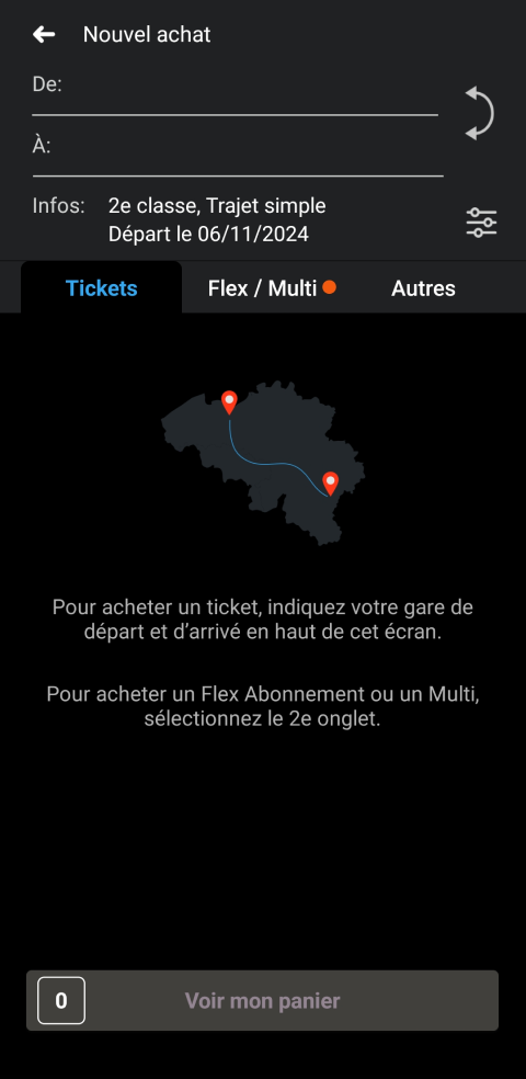
1. Home (Start point)
→ Interaction: Click on the basket icon
2. Pop-up — Choose the type of purchase
→ Interaction: Select « Train ticket »
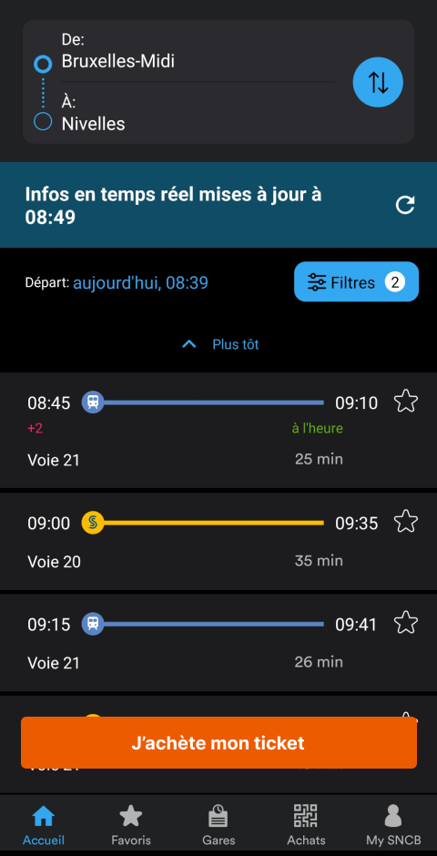
3. « Your journey » screen
→ Interaction: Click on « Departure station »
4. « Departure station » screen
→ Interaction: Select a departure station
5. « Arrival station » screen
→ Interaction: Select an arrival station
6. Back to the « Your journey » screen
→ Interaction: Confirm the journey
7. « Your personalised offer » screen
→ Interaction: Choose « Anytime » (or another option)
→ Interaction: Confirm the journey
8. « Add-on » screen
→ Interaction: Finalise the add-on (or skip)
9. « Basket » screen
→ Interaction: Click on « I accept the terms and conditions »
→ Interaction: Click on « Proceed to payment »
10. « Payment methods » screen
→ Interaction: Select a payment method
11. Bank redirection (within the app or via an external app)
→ Interaction: Complete the payment
12. « Confirmation » screen
→ Interaction: Click on « View my tickets »
13. « My tickets » screen (End point)
4.1.2 Data Summary
This journey includes at least 13 steps and over 17 interactions — far from the promise of a « 3-step » purchase.
4.1.3 Pain points
4.1.3.1 It’s too long
First of all, the journey is clearly too long. While a three-step purchase is promised, the user is faced with a series of screens and interactions that unnecessarily complicate the process. This feeling of slowness is reinforced by the app only displaying one screen at a time, forcing the user to move forward step by step without any real overview.
4.1.3.2 The add-ons
Additionally, some steps seem unnecessary. For example, the add-ons screen is always displayed, even if the user has never purchased this type of option before. This introduces a non-relevant step for the majority of users, which goes against a truly personalised journey.
4.1.3.3 Choice of options
Moreover, during the personalised offer step, the user is invited to make a choice… even though in reality, only one option is sometimes available. This creates an artificial sense of choice, extending the process without adding any value.
4.1.3.4 One screen at a time
The app forces a linear screen-by-screen journey, with no possibility of having an overview of the journey or of already selected information. Each element — departure station, arrival station, time, offer, etc. — is displayed on a separate screen, fragmenting the experience and creating a sense of slowness. This sequential navigation also makes it difficult to go back to a previous step or to modify multiple elements in one place. As a result, the user loses time and context at every step.
4.1.3.5 No default selection
The app doesn’t offer any pre-filled or smart selections based on user habits or the most frequent choices. For every journey, everything has to be selected manually: stations, ticket type, time of day, etc. Even when only one option is available (e.g., a single offer in « Your personalised offer »), the user still has to select it manually. This lack of automation makes the process heavier and goes against UX best practices, which recommend minimising required actions when choices are obvious or repetitive.
4.2 Previous application
Before the redesign, the SNCB mobile app offered a more compact purchase journey and, paradoxically, was often faster despite a more outdated visual interface. The key steps (selecting the journey, choosing the offer, payment) were grouped more directly, with fewer intermediate screens. For example, it was possible to view the departure and arrival stations on a single screen, which provided a better overall view.
4.2.1 Data Collection
1. Home (Start point)
→ Interaction: Click on the « Purchase » icon in the navigation
2. « Purchase » screen — No active ticket
→ Interaction: Click on « New purchase »
3. « New purchase » screen
→ Interaction: Select the departure station
4. Screen: « Departure station » field
→ Interaction: Select the departure station
5. « New purchase » screen
→ Interaction: Select the arrival station
6. Screen: « Arrival station » field
→ Interaction: Select the arrival station
7. « New purchase » screen
→ Interaction: Add and choose the type of ticket
→ Interaction: Add to basket
8. « Finalize purchase » screen
→ Interaction: Accept the terms and conditions
→ Interaction: Click on « Pay »
9. Bank redirection (within the app or via an external app)
→ Interaction: Complete the payment
10. « Confirmation » screen
→ Interaction: Click on « View my tickets »
11. « My tickets » screen (End point)
4.2.2 Data Summary
This journey includes at least 11 steps and over 12 interactions — far from the promise of a « 3-step » purchase.
4.2.3 Pain points
4.2.3.1 Direct access to the purchase tab
In the previous version, even though ticket purchasing was included in the navigation, the associated icon was not always explicit or highlighted. This sometimes forced the user to fumble around to figure out how to start a new purchase, especially if no active ticket was present. The entry point was therefore not optimized for quick access.
4.2.3.2 Not prioritised
The interface did not clearly prioritise ticket purchasing, despite its central role in the app. The user had to go through an intermediate screen stating that no ticket was active before accessing the purchase form. This detour made the experience slower and more fragmented, whereas a direct shortcut to purchasing could have simplified the usage.
4.2.3.3 Slow station selection
The station selection process lacked fluidity. Searching was not always intuitive, and autocomplete could be slow or imprecise. Furthermore, no history or preferences were offered, forcing the user to re-enter stations manually for each purchase — even for frequent trips. This unnecessarily slowed down the process.
4.3 Ticket Machine
In addition to the mobile app, SNCB provides physical ticket machines in stations for ticket purchases. These devices, designed for on-site and self-service use, offer a structured and often more direct purchase journey. Their design is meant for quick interaction, with clear visual elements, linear steps, and a large screen allowing several pieces of information or actions to be grouped together. In this section, we will analyse the user journey proposed by the machine in order to compare it with the mobile versions (old and new) and identify strengths and weaknesses in terms of efficiency, accessibility, and clarity.
4.3.1 Collecte des données
1. Home (Start point)
→ Interaction: Click on « To continue, click here »
2. Screen: Journey selection
→ Interaction: Choose the arrival station
3. Screen: Arrival station
→ Interaction: Choose the arrival station
4. Screen: Journey selection
→ Interaction: Click on « Next »
5. Screen: Product choice
→ Interaction: Select the type of ticket (single, return, etc.)
→ Interaction: Click on « Next »
6. Screen: Ticket details (class, date, time…)
→ Interaction: Configure the options
→ Interaction: Click on « Next »
7. Screen: Confirmation
→ Interaction: Confirm the order
8. Screen: Payment
→ Interaction: Make the payment
9. Screen: Ticket reception
→ Interaction: Retrieve the ticket (printed or QR code)
4.3.2 Data Summary
This journey includes at least 9 steps and over 11 interactions — again, far from the promise of a « 3-step » purchase.
4.3.3 Pain points
4.3.3.1 Access depends on crowding
The user experience on the ticket machine heavily depends on the context: if several people are waiting, access can become slow or even stressful. Unlike a mobile app, use of the machine is conditioned by waiting times and how long other users take. This can be a barrier, especially during peak hours or in busy stations.
4.3.3.2 Requires physical presence at a machine
One of the main limitations of using ticket machines is geographical accessibility. You not only have to be physically in a station, but also have a machine that is available and functional. Outside of this environment, the service is simply unusable, which greatly limits its flexibility compared to a mobile solution available anytime.
4.3.4 Positive points
4.3.4.1 The fastest
The main advantage of the SNCB ticket machine is the speed of the user journey. Thanks to a clear interface, large screens that group several pieces of information, and a linear structure, the purchase process is smooth and efficient. In just a few steps, the user can select their destination, choose a ticket, and complete payment. Among the three solutions analysed (old app, new app, machine), this is the shortest and most direct journey.
💡 5. UX Recommendations
5.1 Proposed solutions
5.1.1 Integrate ticket purchasing into the home screen
To simplify access to the app’s most frequently used feature, it would be relevant to integrate a « Buy a ticket » button directly on the home screen. This would allow the user to start the journey without going through menus or unclear icons, immediately reducing the number of required clicks.
5.1.2 Go back to the old approach
Even though the old interface was less modern, it had the advantage of being faster and more condensed. Reintroducing some of its principles — such as grouping key steps on a single screen or removing non-essential screens — could help restore a smoother and more efficiency-focused experience, without giving up the redesigned visual style of the new version.
5.1.3 Optimise station selection
Station selection can be significantly improved by integrating faster predictive input, access to recent or favourite stations, or even optional geolocation to automatically detect the departure station. This would reduce friction in the first steps of the journey, which are often the most time-consuming.
5.2 Deliverables / prototypes
5.2.1 Purchase or planning
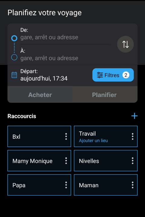
To improve immediate access to the app’s main function, I added a « Buy » button right next to the « Plan » button on the home page. This small visual adjustment allows the user to start a purchase as soon as the app opens, without having to navigate through secondary menus.
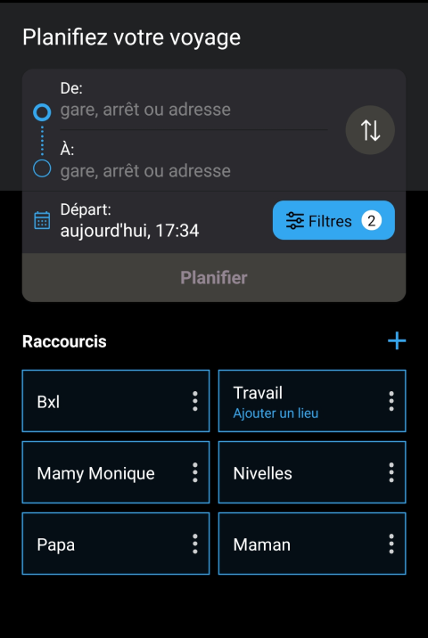
– Home screen before
– Home screen after
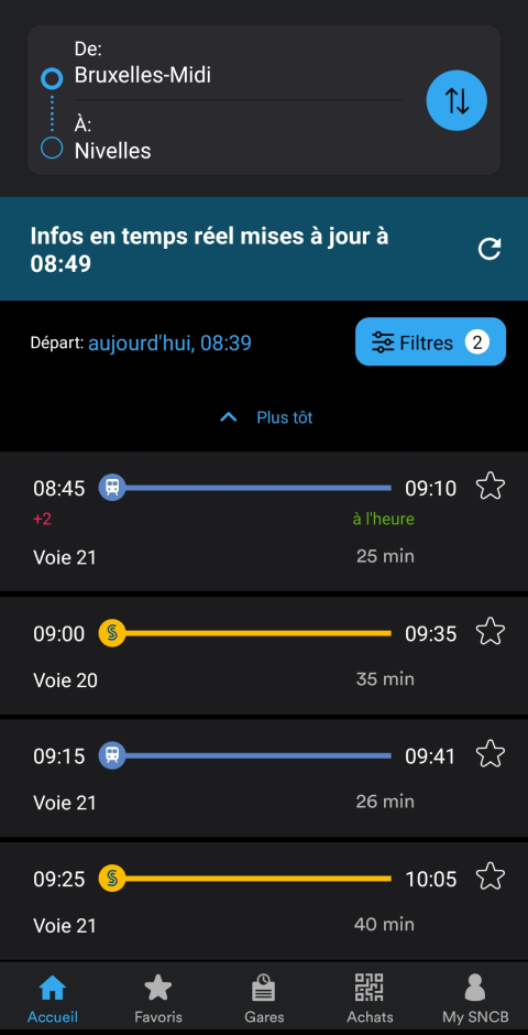
5.2.2 Purchase from the timetable
I also integrated a « Buy » button on the screen displaying the timetable list. This allows users to go directly to ticket purchase from a route search, without having to restart the journey from the home screen. The user saves time and stays in a logical flow.
– Planning screen before
– Planning screen after
5.2.3 Faster station selection
To further streamline the journey, I reused the quick station selection widget used in the planner and integrated it at the beginning of the purchase process. This allows the user to quickly choose recent or favourite stations, without having to retype them each time.
– Station selection screen before
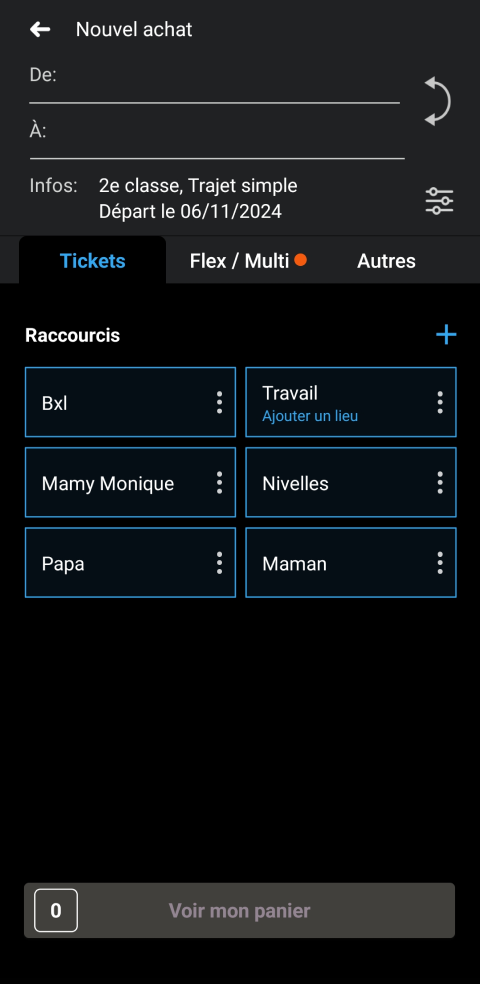
– Station selection screen after
📘 6. Learning & transposition (conclusion)
This analysis shows that user experience cannot be evaluated solely based on promises or principles presented by an interface. It is essential to test journeys in real conditions, with real needs and real constraints. Accurately counting the number of screens, interactions, and steps required reveals significant gaps between intention and reality. This kind of approach highlights concrete opportunities for optimisation, focused on actual usage rather than the appearance of the journey.