SPF ● Case Study
🧱 1. Case context
The Federal Public Service (FPS) Finance is one of the pillars of the Belgian federal administration. Its website https://finances.belgium.be serves as a central entry point for millions of citizens, self-employed workers, non-profits and companies seeking information or trying to carry out fiscal, customs or property-related procedures.

❓2. Problem / Opportunity
The FPS Finance website stands out for the richness and breadth of its content. It brings together a vast range of information covering various areas: taxation for individuals and businesses, customs, inheritance and property matters, official documents, support schemes, legislation, forms, etc. This density, while necessary to fulfill the FPS’s mission, creates significant complexity for the end user.
🗂️ 3. Research plan (Planning)
To better understand friction points and improvement opportunities, the user journey will be analysed from the homepage to the section dedicated to tax declaration. Particular attention will be paid to how information is structured, the navigation logic between pages, and the site’s ability to clearly guide users through their processes. The analysis will also focus on the « Individuals » section, which contains most of the content intended for the general public, to evaluate the consistency and readability of the proposed content. Lastly, an in-depth observation of real user journeys will help identify potential obstacles, moments of confusion, and elements that either help or hinder the completion of expected tasks.
🎯 4. Study phase
4.1 Homepage
The homepage is the main entry point of the FPS Finance website. It plays a central role in user orientation, providing an overview of available services and facilitating access to the most common procedures. In a public service context like this, where audiences are diverse — citizens, self-employed people, companies, finance professionals — clarity on the homepage is essential to quickly meet everyone’s needs.
4.1.1 Data collection
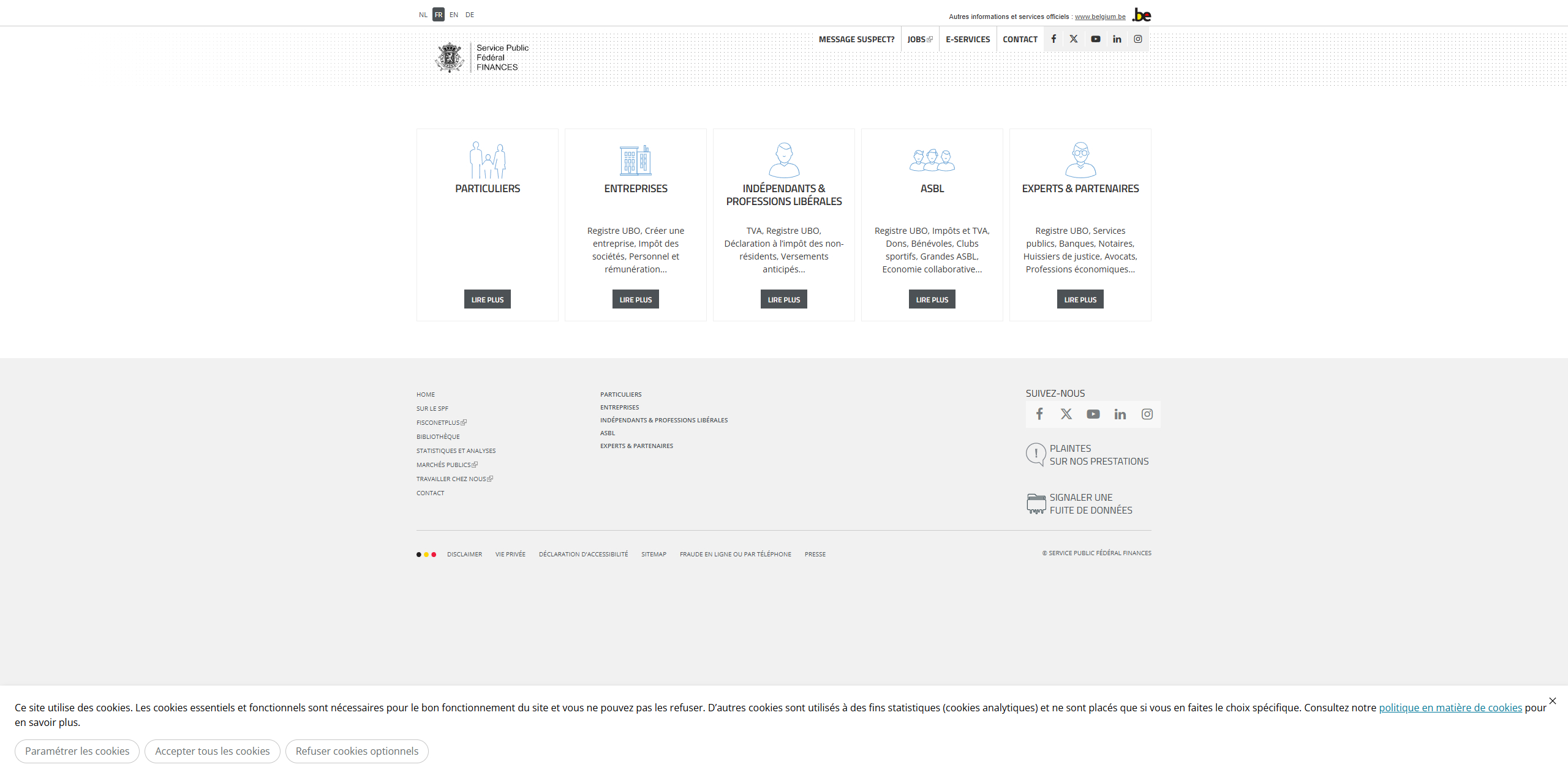
– Homepage of the FPS website
4.1.2 Data summary
The structure of the FPS Finance homepage relies mainly on five main entry points, presented as clickable cards. Each one corresponds to a specific user profile: Citizens, Companies, Self-employed and liberal professions, Non-profits, and Experts & partners. This organisation aims to quickly direct users to the content intended for them by segmenting information based on their administrative or professional status.
4.1.3 Pain points
4.1.3.1 A sense of emptiness
The homepage gives a surprising sense of emptiness for a government website of this scale. No real content is visible except for the five main user categories. There is no welcome message, no context, no quick access to frequent procedures or tax news. This lack of direct information can make the visitor feel neither welcomed nor guided, which harms the first impression and trust in the site.
4.1.3.2 A page that’s not really a page
More than a true homepage, it is essentially a redirection screen to other parts of the site. It has no content of its own: no summary, no presentation of the FPS Finance, no direct access to commonly used tools. It acts as a sorting interface without added value in itself, which breaks with the usual user expectations for a homepage, often seen as a structural anchor in navigation.
4.1.3.3 Five links, but no content
The page relies entirely on five blocks representing major user categories. No additional content is offered to help users make an informed choice — especially if they don’t immediately identify with one of the categories. This greatly limits the site’s cognitive accessibility and may hinder entry into the journey, particularly for users unfamiliar with administrative vocabulary.
4.1.3.4 A double navigation bar that’s not very functional
The homepage features two stacked navigation bars, which adds to the confusion. The first one, very discreet, gives access to institutional or technical links; the second contains broader menus, but these do not highlight the concrete actions users typically want to perform. This double navigation lacks clarity and effectiveness: it takes up a lot of space without actually helping users quickly access key services, such as filing a tax return, paying a tax, or consulting their tax file.
4.2 Individuals Page
The « Individuals » section is one of the main entry points of the FPS Finance website. It is intended to gather all tax-related information and procedures that concern citizens in their private lives: tax returns, payments, refunds, housing, inheritance, etc. This is a key area of the site, concentrating a large share of traffic, especially during tax return periods or when tax assessment notices are received.
4.2.1 Data Collection
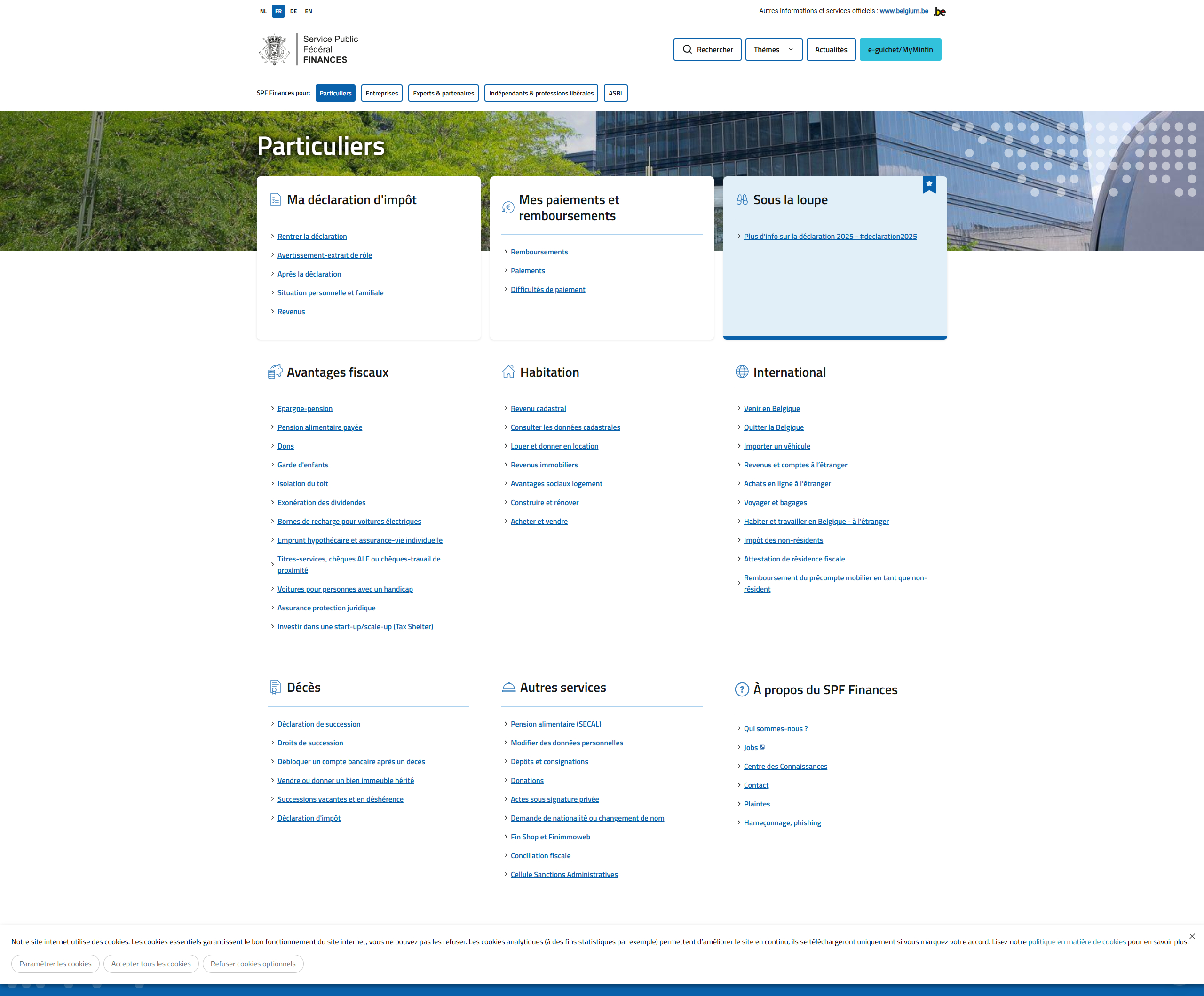
– « Individuals » page of the FPS website
4.2.2 Data Summary
The « Individuals » page is visually organised around a grid of thematic cards, each representing a specific area related to personal taxation. Each card follows the same structure: an illustrative icon, a concise title, and a list of grouped links. These links lead to more detailed internal pages, corresponding to procedures, practical information, or legal explanations.
4.2.3 Pain points
4.2.3.1 Page structure
The « Individuals » page does not offer any editorial content of its own. It is limited to a series of cards containing lists of links, without introduction, explanation, or guidance. There is no contextualisation to help users quickly understand what each topic is about, nor any concise summaries to help them identify what is relevant to them. This lack of explanatory content gives the page a raw and technical appearance, which may discourage users who are less familiar with administrative or tax terminology.
4.2.3.2 Number of links
Each card contains several links, and their accumulation creates an immediate impression of overload. The user is faced with a large number of options at once, without any clear indication of which ones are most common, urgent or high-priority. This volume of information presented without hierarchy makes navigation difficult and may cause a kind of decision paralysis: faced with too many choices, the user doesn’t know where to start.
4.2.3.3 Number of cards
The page contains a large number of thematic cards, which dilutes attention and unnecessarily lengthens the visual journey. Some cards cover very specific topics, others very broad ones, with no apparent logic in their order of presentation. This multiplication creates a sense of fragmented information and forces users to scroll through the entire page even if they are looking for basic information. The lack of grouping or filtering reinforces the impression of a dense, unstructured whole that is hard to scan at a glance.
4.3 Declaration Page
The « Declaration » page plays a central role in the user journey for individual taxpayers, as it relates to one of the most common and sensitive tax procedures: the annual income tax return. It is a key moment in the fiscal year, generating many questions and interactions with the administration. Accessibility, clarity, and structure are therefore essential to ensure a smooth, reassuring, and efficient user experience.
4.3.1 Data Collection
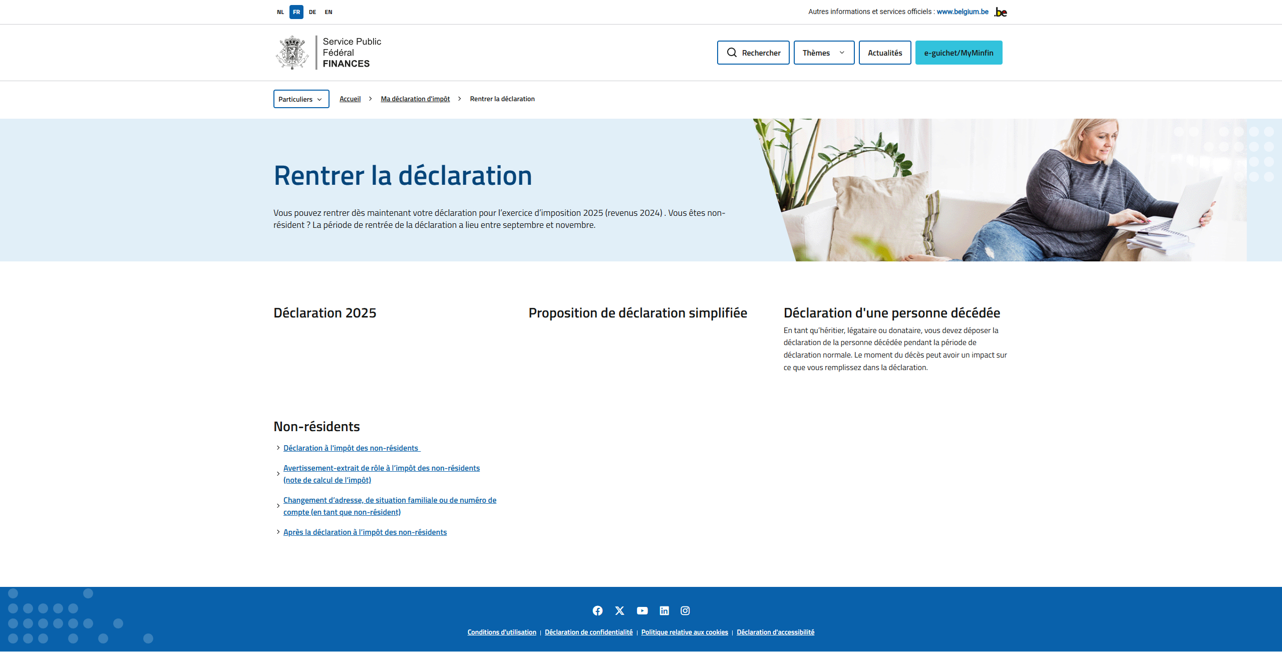
– Declaration page on the FPS Finance website
4.3.2 Summary of Findings
The « Filing your return » page is divided into four distinct sections, each introduced by a main heading. However, the composition of these sections remains quite sparse: some contain only a title, others a short description, and sometimes a list of links. There is no real content developed directly on the page.
4.3.3 Pain Points
4.3.3.1 An Almost Empty Page
The « Filing your return » page stands out for its extreme simplicity, to the point of appearing empty. Apart from four section titles, a few lines of text, and a few links, no explanatory or visual content is provided. Users are given no contextual markers to understand what they need to do, when, or why. This lack of information reinforces the perception of austerity and opacity, which is particularly problematic for such an important procedure as the tax return.
4.3.3.2 A Simple List of Links
The page consists solely of a series of links distributed among different sections, without added value. It is not an informative page, but rather a flat navigation hub. No element is highlighted, no task is guided, and links are presented without any clear priority or explanation. This impersonal presentation makes navigation difficult, especially for less experienced users looking for clear steps or visual guidance.
4.3.3.3 Links Not Easily Accessible Elsewhere
Some of the links on this page are not easily found elsewhere on the site. This means that if the user doesn’t pass through this specific page, they may never access certain useful resources. This reliance on a single navigation page, without duplication in menus or internal search tools, harms overall content accessibility. It also increases the risk of users dropping out or making mistakes in their journey.
4.3.3.4 A Page That Is Just a Disguised Menu
Ultimately, this page does not serve a true content function. It acts like a secondary menu — static, unexplained, and lacking a narrative structure. It does not help users project themselves into the different stages of the filing process, nor does it explain the logic behind it. This lack of guidance negatively affects the experience, especially in the context of a stressful administrative procedure, where users expect clarity, support, and reassurance.
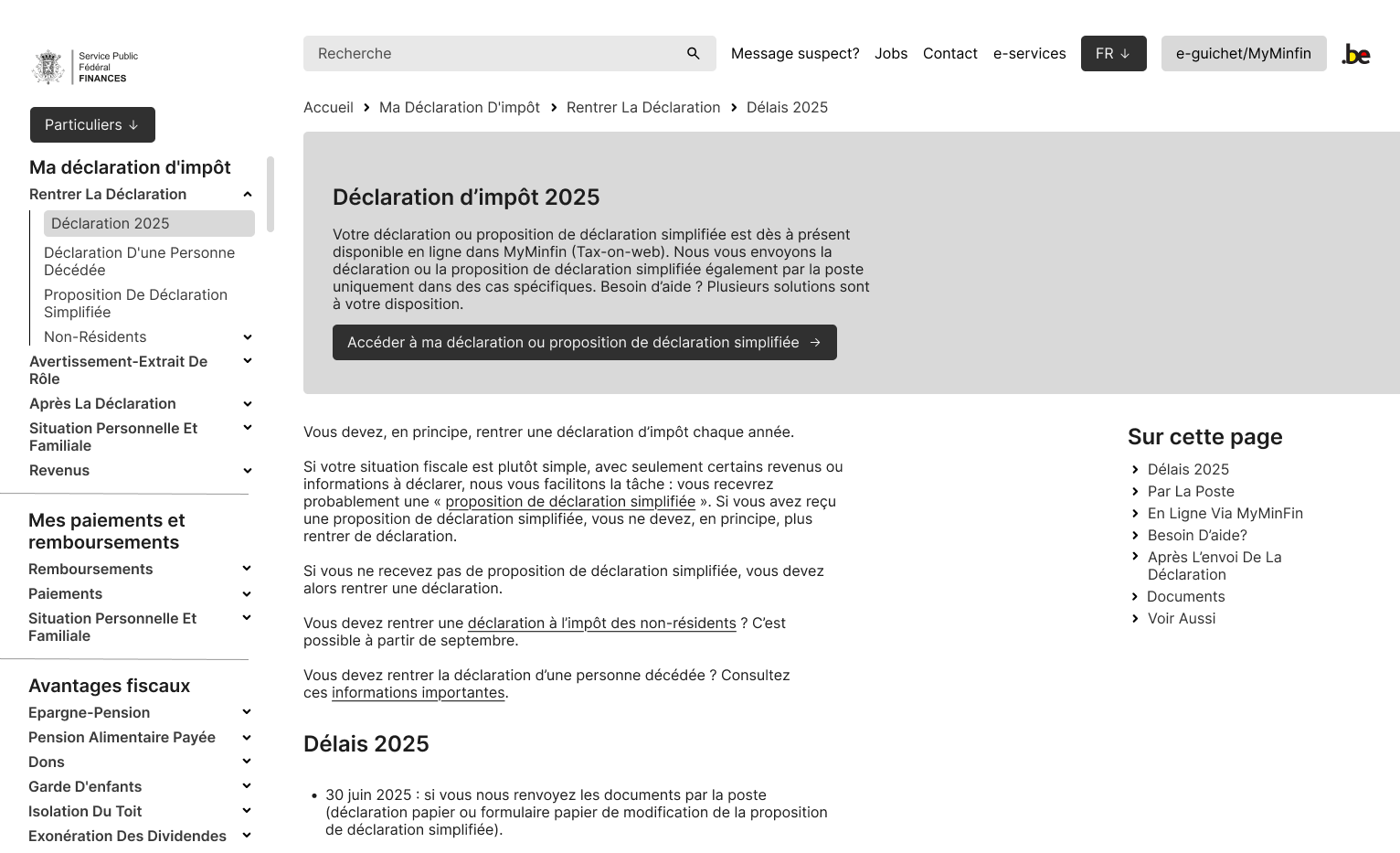
4.4 2025 Tax Return Page
The « 2025 Tax Return » page brings together all the information related to the current year’s tax return campaign. It serves as a central hub for practical content: deadlines, submission methods, new fiscal measures, specific procedures, and the support options provided by the administration. Its goal is to guide citizens through this important period of the tax calendar by offering a clear and well-structured overview.
4.4.1 Data Collection
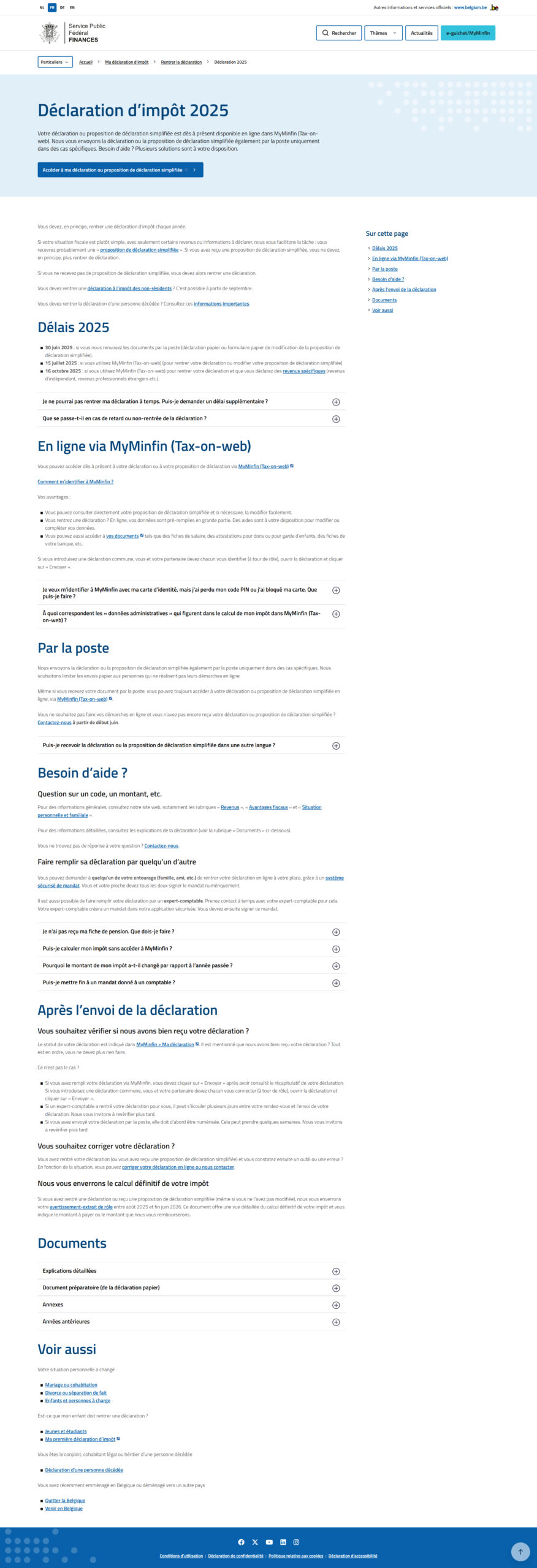
– 2025 Tax Return page on the FPS Finance website
4.4.2 Summary of Findings
The « 2025 Tax Return » page clearly stands out from other parts of the site, with a more developed structure and a visible effort toward clarity. It opens with an engaging header and a prominent call-to-action (CTA) that immediately directs users to the main procedures. This top-of-page positioning provides quick access to essential tools such as the Tax-on-web platform.
The rest of the page is divided into several informative sections, which are well-written and relatively easy to understand. Each block addresses a specific aspect of the tax return process: deadlines, submission methods, changes for the year, and available assistance services. The tone is neutral yet instructive, and the content is detailed enough to answer key questions without requiring further research.
Finally, the page includes a side table of contents that supports navigation. This fixed menu allows users to jump quickly from one section to another, which is particularly useful for a long page. It helps organize the content and enhances readability, especially for users who want to get straight to the point.
4.4.3 Strengths
4.4.3.1 Effective Header
First, the header fully serves its purpose: it is clear, visible upon arrival on the page, and includes a well-positioned call-to-action button that leads directly to the online tax return area. This strategic placement makes it easier for users to start their journey without having to scroll or search for information.
4.4.3.2 Information Hierarchy
One of the page’s main strengths lies in its information architecture. The content is divided into clearly identified sections, with explicit headings and a side table of contents that facilitates internal navigation. This logical structure allows users to quickly find the section that interests them while maintaining an overall understanding of the tax return process.
4.4.3.3 Complete Information
Finally, the level of detail and completeness of the information is worth highlighting. Unlike other more limited pages on the site, this one offers clearly written and structured content covering all key aspects of the return process. The explanations are accessible without being simplistic, and the links to useful services or documents are well integrated. This helps reassure users and provides them with a reliable framework to complete their tax return.
4.5 User flow
After reviewing the main pages of the website, this section focuses on analyzing the user journey related to filing a tax return. The goal is to understand how a user, starting from the homepage, is expected to navigate to the online tax filing tool, while accessing all necessary information along the way.
4.5.1 Data Collection
Homepage (Start point)
↓
“Individuals” button (Interaction)
↓
Individuals page
↓
“File your tax return” link (Interaction)
↓
File your tax return page
↓
“2025 Tax Return” link (Interaction)
↓
2025 Tax Return page (End point)
4.5.2 Data Summary
The user journey analyzed in this case starts on the SPF Finances homepage and aims to guide a citizen to the central page « 2025 Tax Return, » where they can access all the necessary information to complete their tax declaration.
Here is how the journey unfolds: the user starts on the homepage (start point) and must click on the “Individuals” button (interaction). This leads to a dedicated page composed of various thematic cards. There, the user must identify and select the card containing the “File your tax return” link (interaction), which opens a new intermediary page.
Although very minimal, this page includes a link to the “2025 Tax Return” page (interaction), which represents the end point of the journey.
4.5.3 Pain Points
4.5.3.1 Too many intermediate steps
While the journey to the “2025 Tax Return” page is functional, it involves a high number of intermediary steps before reaching the final destination. Each additional action—clicking a card, opening a new page, searching for a link—adds unnecessary cognitive load. This might seem trivial for experienced users, but for less tech-savvy citizens, these multiple interactions can become a barrier, causing confusion, drop-offs, or a sense of complexity. The journey would benefit from being shortened or better signposted to meet UX principles of efficiency and clarity.
4.5.4 Positive Points
4.5.4.1 A logical progression
Despite its length, the user journey follows a clear thematic logic. Each step leads the user to a consistent subcategory: from the general homepage to the « Individuals » section, then to tax filing, and finally to detailed information. This hierarchical progression helps place information in context and allows users to understand where they are within the site. While the journey could be improved, it respects an intuitive information architecture that provides a certain level of clarity.
💡 5. UX Recommendations
5.1 Proposed Solutions
5.1.1 Remove unnecessary steps
The current path to the “2025 Tax Return” page includes several steps that provide little to no added value to the user. To improve the experience, it would be beneficial to reduce the number of required clicks by removing some intermediary pages, such as “File your tax return,” which contains almost no content. Users should be able to reach key information more quickly without having to navigate through a series of empty or repetitive pages. Simplifying the flow would speed up information retrieval and reduce cognitive overload.
5.1.2 Permanent access to all information
Currently, some pages act as required gateways because they contain links that are not available elsewhere. This creates an artificial dependency on those pages and limits content discoverability. To address this, it would be helpful to integrate these links into a transversal navigation system, such as a sidebar menu or a well-structured footer. This would ensure that all essential information is accessible at all times, regardless of where the user is on the site. It would also strengthen site coherence and make navigation more fluid.
5.1.3 Improved navigation
The current navigation relies primarily on a structure of cards and loosely prioritized links. To better guide users, the global navigation should be improved by rethinking the menus, information hierarchy, and access paths. A clearer main menu, more visible secondary navigation, and better visual signposting would create consistent reference points for users. This would make the journey more intuitive and reduce the risk of disorientation, especially in the context of complex administrative processes.
5.2 Deliverables / Prototypes
5.2 Deliverables / Prototypes
To concretely illustrate possible improvements, a wireframe of the “2025 Tax Return” page has been created. The goal is to offer a clearer, better structured, and more functional version for users. This prototype includes several key adjustments designed to improve navigation and information access. Three main axes guided the design:
– Wireframe: “2025 Tax Return” page
5.2.1.1 Addition of an exploration tool
An interactive tool allowing users to filter content based on their needs has been added at the top of the page, in the form of a dropdown menu or thematic filters. It would allow users to select their profile or situation (e.g., employee, self-employed, retired, joint return, etc.) to display only the relevant sections. This makes the page more personalized and easier to browse by reducing information overload.
5.2.1.2 A single, more coherent navigation bar
The wireframe proposes merging the two navigation bars currently present on the site, which are often redundant and poorly structured. The idea is to create a single, clear, and stable navigation bar that gathers access to main sections, online services, and help pages. This simplification enhances consistency and strengthens the clarity of the user journey.
5.2.1.3 Maintain current page format
The current structure of the page, composed of informative text blocks and a fixed sidebar table of contents, remains relevant. The wireframe therefore proposes keeping this format while improving its design and readability. This preserves familiar reference points for returning users while optimizing accessibility and content hierarchy.
📘 6. Learning & Application (Conclusion)
This case study highlights a key principle in UX: it is essential to constantly question the purpose behind every action we ask the user to perform. Too often, certain interactions or steps are maintained out of habit or due to technical constraints, without reconsidering their real usefulness.
On the SPF Finances website, several pages act merely as gateways to other content, without providing actual value. This weakens the user flow, increases cognitive load, and harms the overall efficiency of the site.
Designing a good user experience means ensuring that every click, every interaction, every piece of content serves a clear, understandable, and useful purpose. It is by asking this question at each step that we can build simple, effective journeys truly centered on the user’s needs.