Twitch ● Case study
🧱 1. Case Background
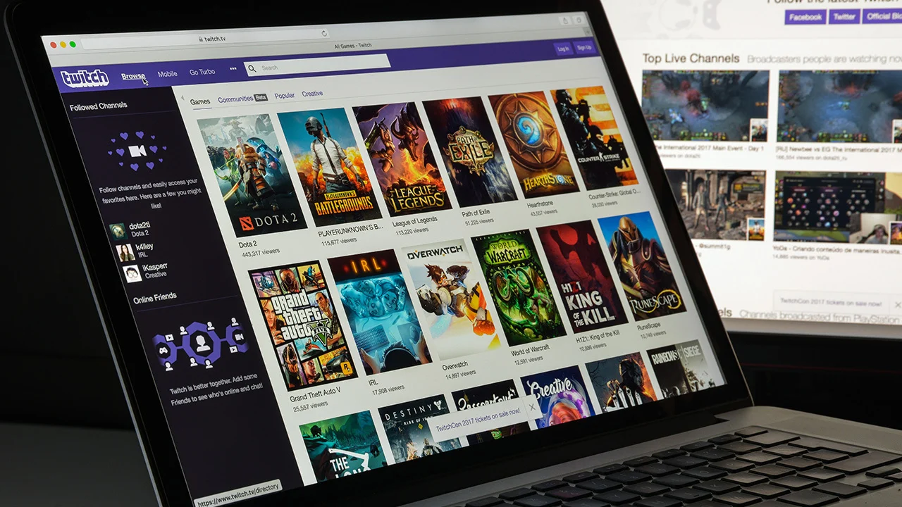
Twitch is a live video streaming platform, primarily known for its content related to video games, e-sports, and real-time broadcasts by content creators. Launched in 2011 and acquired by Amazon in 2014, Twitch has steadily established itself as a major player in online entertainment, with millions of daily active users. Viewers can watch streamers play, chat, create, or simply share their everyday lives.
❓Problem / Opportunity
In a previous version of its mobile app (prior to the latest one), Twitch made a significant change in how users accessed the platform: the homepage was replaced by an exploration page, radically altering the app’s opening experience.
Upon launching the app, users were immediately dropped into a live stream, automatically selected by the platform, without any prior interaction or consent. This sparked many reactions, as it broke away from the more passive or controlled experience users were used to when opening the app. Twitch’s objective seemed to be to increase immediate immersion, boost creator visibility, and lengthen watch time.
🗂️ 3. Research Plan
To assess the impact of this mobile app update on the user experience, two main areas of analysis were defined: The relevance of the “Stories” feature ; The new homepage
🎯 4. Research Phase
4.1 Stories
By introducing stories to its mobile app, Twitch aligned itself with an already well-established trend in the social media world. This short, ephemeral, vertical format—popularized by Snapchat and widely adopted by Instagram, TikTok, and YouTube—allows creators to share informal, quick, and often more personal content with their community.
4.1.1 Data Collection
– Stories on the Twitch homepage
4.1.2 Data Summary
Each bubble represents a creator who recently posted a story. When a user taps on a bubble, the story opens in full-screen mode. The content may include a photo, a short video, or a written message. Stories play automatically, in a vertical and dynamic format.
4.1.3 Pain Points
4.1.3.1 Role of Stories
On platforms like Instagram or TikTok, stories have become a central communication tool between creators and followers. They’re used to share daily moments, promote content, or simply stay visible in users’ feeds.
On Twitch, however, the platform’s core value lies in live interaction. It’s the real-time exchange between streamer and community that defines the experience. Adding stories blurs the line between live streaming and traditional social media. The key question is: Do stories truly enhance the Twitch experience, or are they an attempt to follow a trend without a clear fit with the platform’s natural usage?
4.1.3.2 Consistency
Twitch is a community-focused platform centered on live interaction, authenticity, and long-form content. Stories—brief, and often polished—may seem at odds with this dynamic. They introduce a fast-consumption logic that can feel superficial compared to the deep engagement expected from a live stream.
4.1.4 Positive Aspects
4.1.4.1 New Interaction Channel
Despite some criticisms, stories do offer creators a new way to communicate with their community. Outside of live sessions, streamers now have a space for more spontaneous and frequent updates, without needing to start a full stream.
4.2 The New Homepage
In a major update, Twitch replaced its old homepage with a redesigned version, now centered around the exploration page. This change has deeply transformed the navigation experience: upon launching the app, users are immediately presented with a live stream chosen by the platform—even if they don’t follow that creator.
4.2.1 Data Collection
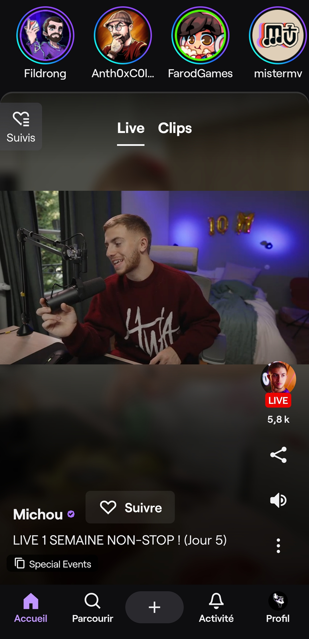
– Twitch mobile app homepage
4.2.2 Data Summary
Since the redesign, the Twitch mobile app homepage has been rebuilt around instant content exposure. Upon opening the app, users are shown a suggested live stream that starts playing automatically, without any action on their part.
Above this live video, a horizontal stories bar displays recently posted short content by creators.
4.2.3 Pain Points
4.2.3.1 Poor Format Fit
The auto-play live stream is in horizontal format, which makes sense for streaming but doesn’t integrate well within a vertically oriented interface. The result is a partially empty screen, which feels unbalanced and less immersive, creating a sense of wasted space.
4.2.3.2 Content Relevance
The suggested live streams aren’t always aligned with the user’s followed channels or viewing habits. This sometimes causes confusion, as users are shown streams they would never have selected themselves. It weakens personalization—one of the expectations on a platform like Twitch—and raises questions about the quality of recommendations.
4.2.3.3 Access to Followed Creators
With this new setup, accessing followed creators now requires an extra step: opening the side menu (burger menu) to reach the « Following » list. While seemingly minor, this change adds friction for regular users who mainly open the app to watch their favorite streamers. It gives the impression that suggested content is now prioritized over personalized content—potentially frustrating loyal users.
4.2.4 Positive Aspects
4.2.4.1 Discovery & Visibility
One of the strengths of this new homepage is its encouragement of content discovery. By highlighting a suggested live stream right from the start, Twitch nudges users to step outside their usual bubble and explore what’s happening in real time on the platform.
💡 5. UX Recommendations
5.1 Proposed Solutions
The homepage redesign clearly shows Twitch’s intent to encourage discovery and exploration. While this brings value, it should not come at the expense of quick access to followed creators, who remain central to user engagement.
A balanced solution would be to maintain the discovery logic while reintroducing followed creators on the homepage—either directly beneath the suggested live stream or in a prominent, always-visible section.
This kind of adjustment would reconcile algorithmic recommendations with user expectations, maintaining a smooth and discovery-rich experience.
5.2 Deliverables / Prototypes
Shortly after this case study was initiated, Twitch released a new app update incorporating several of the proposed improvements. The homepage was rebalanced, making it easier to access followed creators while preserving exploration features. This quick rollout reflects Twitch’s willingness to adapt its UX based on community feedback and real usage patterns.
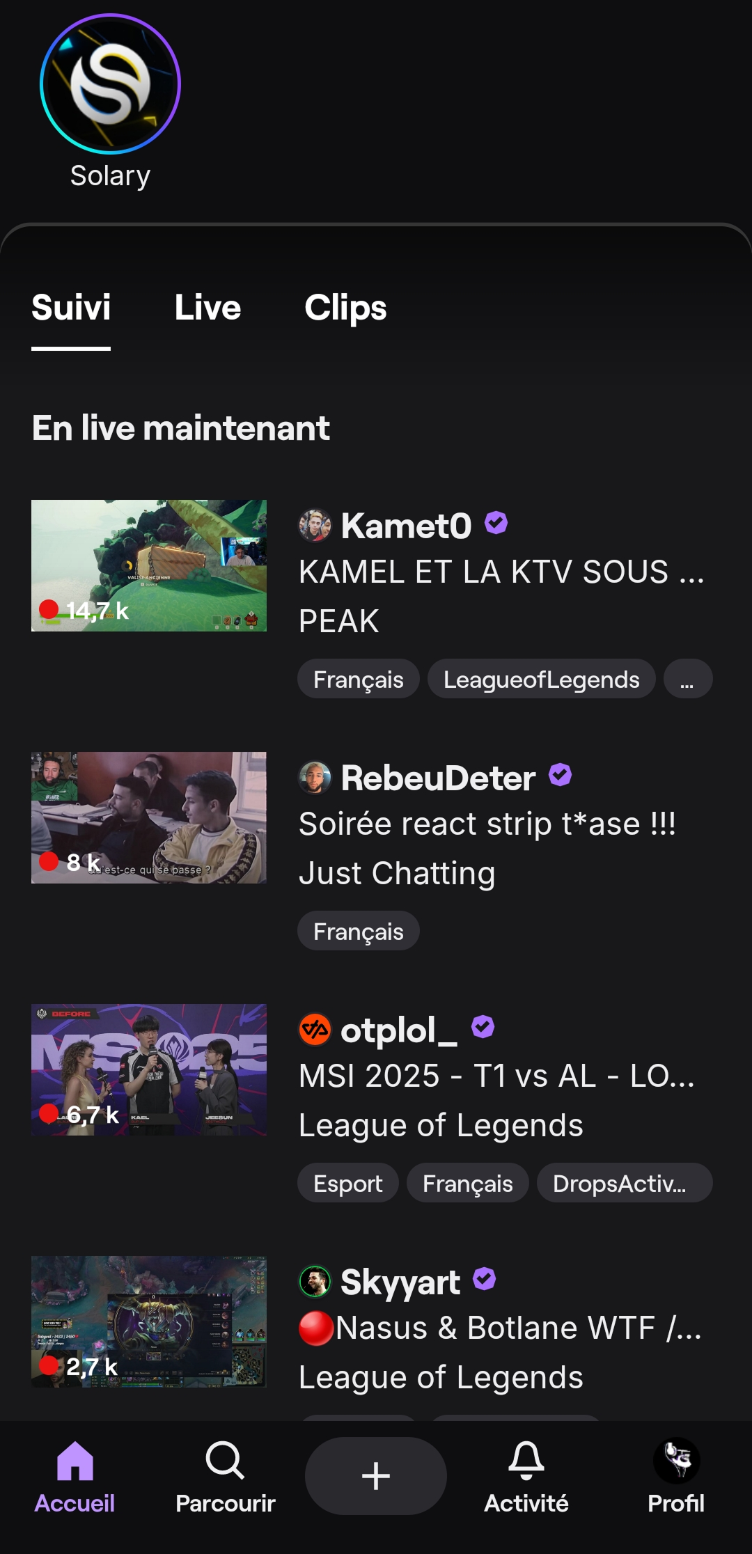
– Twitch mobile app homepage after the update
📘 6. Learnings & Takeaways (Conclusion)
In any product design or update, it’s critical to keep in mind why users come to the platform and what they’re truly looking for. On Twitch, the core experience revolves around connecting with favorite creators, real-time interaction, and the freedom to choose what to watch.
Future changes should always reflect this foundation: discovery is important, but never at the cost of control, simplicity, and personalization—key elements of a strong user experience. By respecting these core expectations, platforms can build interfaces that are both innovative, engaging, and community-centered.